Choosing the Right Colours for a Home Cinema Room
Why Colour is Critical in a Cinema Environment
When designing a home cinema, most people focus on the technology—projectors, speakers, control systems. But one of the biggest factors in how a room actually performs is often overlooked: colour.
At H3 Digital, we approach cinema design as a balance between engineering and aesthetics. The colours you choose for walls, fabrics, seating, and flooring directly affect light control, image quality, and overall comfort.
This guide explains how to get it right.
A home cinema is not just another living space. It’s a controlled environment where the goal is simple: keep your focus on the screen.
Light bouncing around the room is the enemy of good image quality. Brighter surfaces reflect light back onto the screen, which reduces contrast and weakens black levels.
Darker, matte finishes help to:
Absorb stray light
Improve perceived contrast
Enhance immersion
This is why commercial cinemas use dark finishes—but in a home, we can be more flexible while still achieving excellent results.
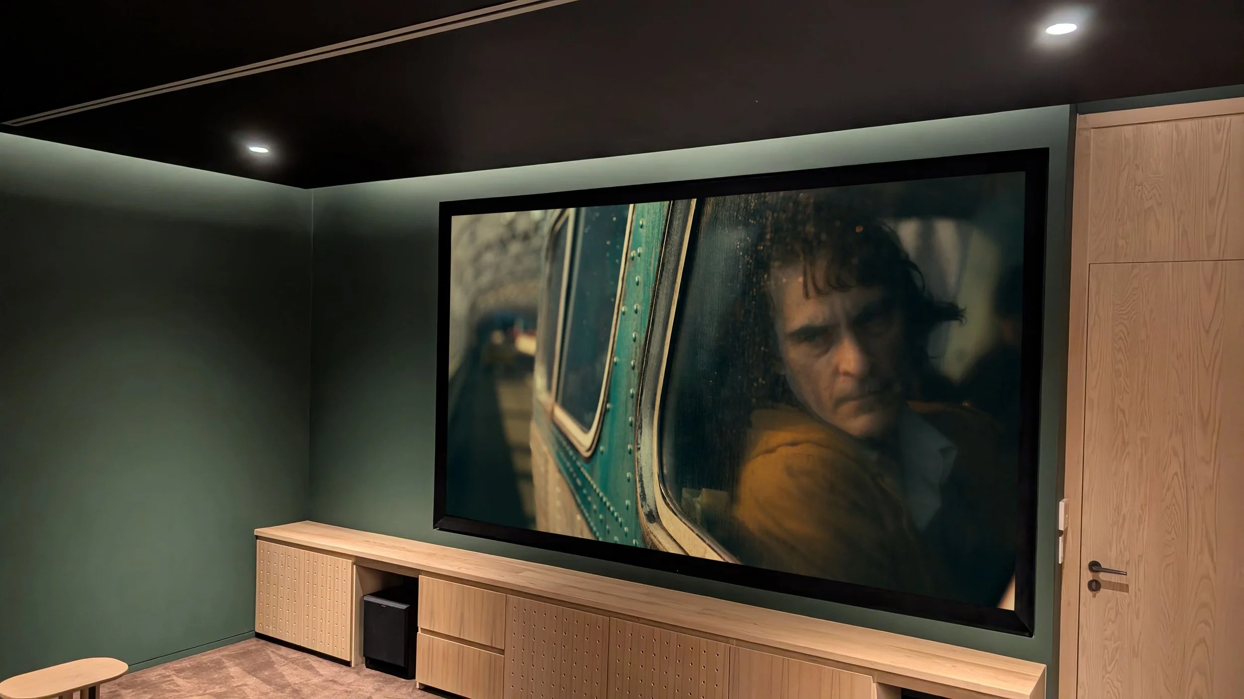
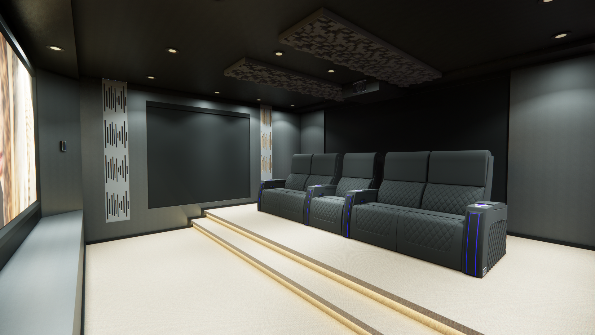
Wall Colours: Performance First, Style Second
Walls have the biggest visual impact and the greatest influence on performance.
Recommended Colours:
Charcoal and deep grey
Dark navy
Earthy tones like deep green or brown
These colours provide strong light absorption without making the room feel overly enclosed.
Try to Avoid:
White or light neutral tones near the screen
Gloss or satin finishes
Highly reflective surfaces
Best Practice:
Use a flat or matte paint finish. Even darker colours can cause issues if they reflect light.

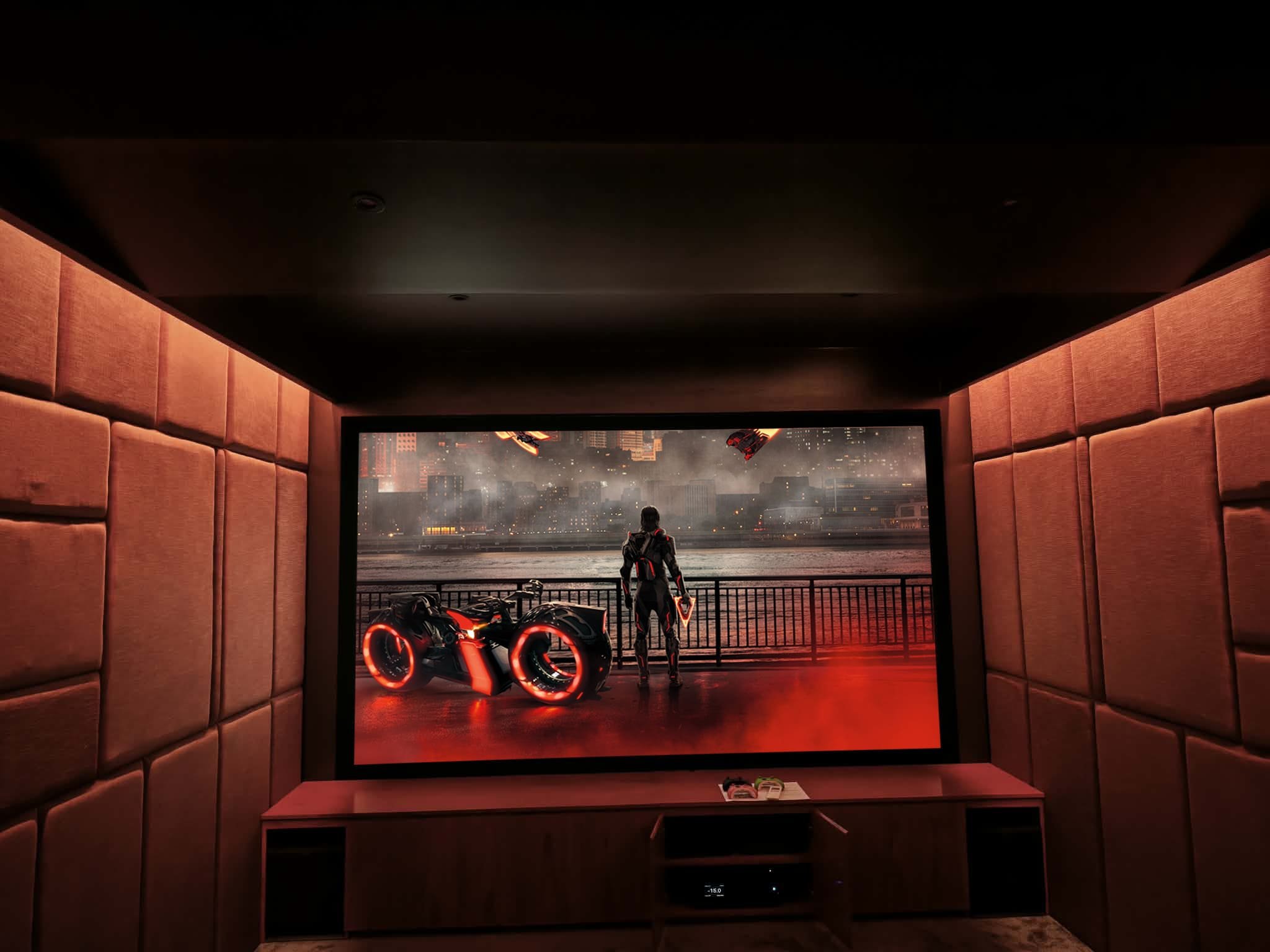
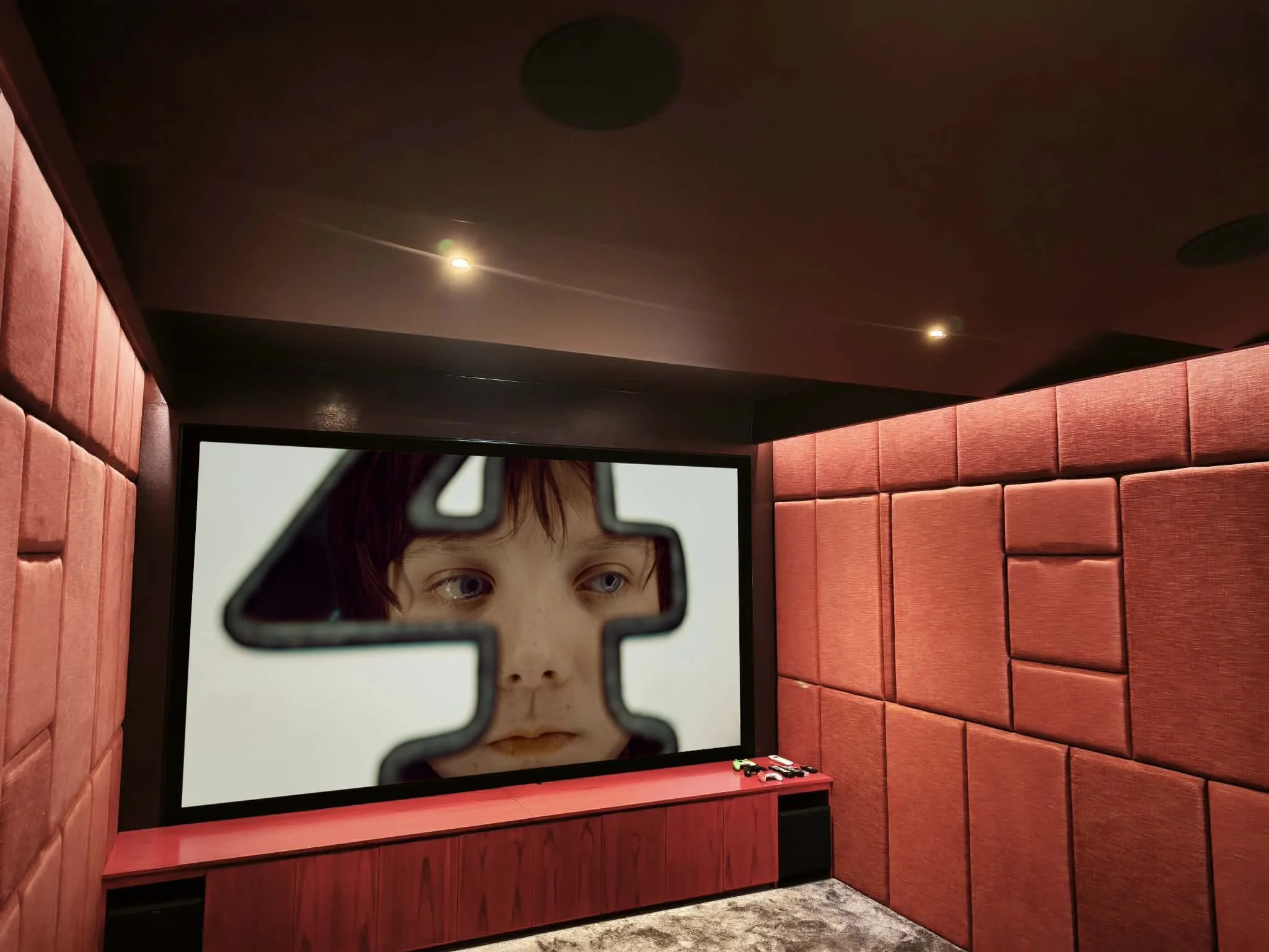
Seating: Balancing Comfort and Reflection
Seating is one of the largest surfaces in the room, so it plays a role in both design and performance.
Typical Choices:
Black leather for a classic cinema look
Dark fabric finishes for reduced reflection
Deep tones like navy or brown
Key Considerations:
Leather reflects more light than fabric
Lighter colours can bounce light back toward the screen
Texture helps reduce visible reflections
In many projects, we position seating and lighting carefully to minimise any impact from lighter finishes where clients want a softer look.
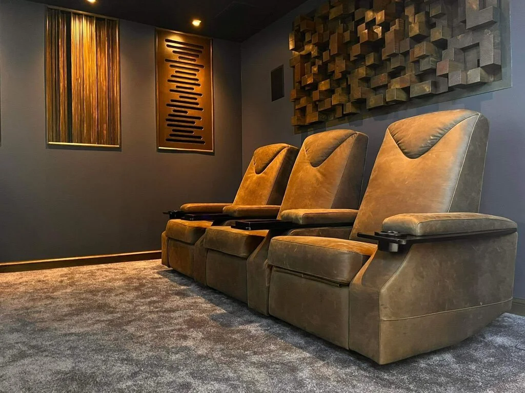
Fabric Wall Systems: A Professional Finish
In higher-end cinema rooms, we often use fabric wall tracking systems instead of painted walls.
Why We Use Them:
Improved acoustic performance
Reduced sound reflections
Minimal light reflection
Clean, tailored appearance
Colour Approach:
We typically keep the base palette dark—black or charcoal—but introduce subtle variation through panel design and texture. This creates visual interest without affecting performance.
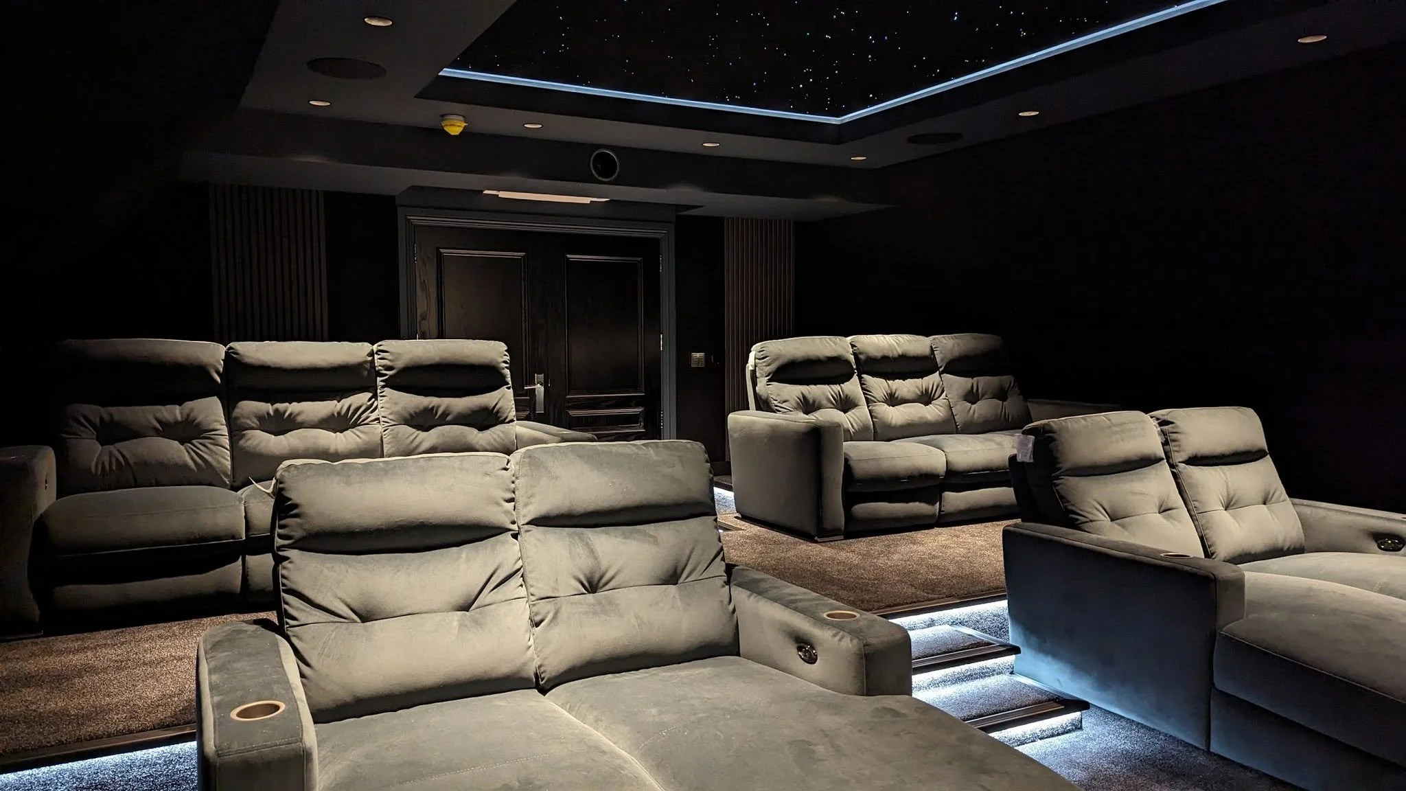
Carpet and Flooring: More Important Than You Think
Flooring contributes to both acoustics and visual control.
Recommended Options:
Dark carpets (charcoal, patterned, or deep tones)
Low-reflective materials
Durable finishes suitable for high use
Benefits:
Absorbs sound and reduces echo
Limits light reflection from below
Helps anchor the overall design
A well-chosen carpet quietly improves the performance of the entire room.
Using Lighter Colours in Multi-Use Spaces
Not every cinema room is fully dedicated. In living spaces or media rooms, a completely dark scheme may not be practical.
In these cases, we recommend:
Keeping the screen wall dark
Using lighter tones toward the rear of the room
Integrating controlled lighting systems
Considering a TV for daytime viewing alongside projection
This allows the space to function day-to-day while still delivering a strong cinema experience when needed.
Creating a Cohesive Design
The best cinema rooms are not just dark—they are well balanced.
A successful scheme often includes:
Dark, non-reflective front wall
Tonal variation across side and rear walls
Textured fabric finishes
Coordinated seating and carpet
Rather than high contrast, we focus on layered tones and materials to create depth without distraction.
Final Thoughts
Colour selection in a home cinema is not purely a design decision—it’s a performance choice.
At H3 Digital, we design each room to ensure that every surface works together, supporting both the technology and the overall experience.
Whether the goal is a fully dedicated cinema or a multi-use media space, the right colour palette makes a measurable difference.
Frequently Asked Questions
What is the best colour for a home cinema room?
Dark tones such as charcoal, black, or deep navy are ideal as they absorb light and improve image contrast.
Do cinema rooms have to be black?
No. While black offers maximum performance, other dark tones can achieve similar results while creating a more comfortable and personalised space.
Can lighter colours be used in a cinema room?
Yes, particularly in multi-use spaces. It’s best to keep lighter colours away from the screen wall and combine them with controlled lighting.
What paint finish should be used?
Matte or flat finishes are recommended to minimise reflections and maintain image quality.
Are fabric wall systems worth it?
Yes. They improve both acoustic performance and light control, while also providing a high-end finish.
Does carpet colour affect performance?
It does. Darker carpets help absorb both sound and light, improving the overall experience.
If you’re planning a home cinema or media room and want to get the balance between performance, usability, and design exactly right, H3 Digital can help guide you through every stage.